I recently had the privilege of being invited to give my first ever meetup talk at SydCSS. It was a first time speakers night so short talks (5 mins) and high nerves were the order of the day. On a recent side project I had wasted a bunch of time creating a fancy loading spinner while I was mentally blocked trying to solve a real problem. I had the idea at the time that I could probably give a reasonably interesting talk by making some loading animations with CSS and explaining the interesting parts of the CSS animation API used for each animation. I had a rough plan and a platform, the rest of this article is the transcript of that talk rewritten as a blog post.
You can view the slides for the talk here, take a look and play around with the examples on the slides!
There are two basic building blocks for CSS animations. Firstly the @keyframes at-rule, which you define with the @keyframes keyword, then a name or identifier for the keyframes set, then a list of steps which define CSS properties for each step.
@keyframes my-sweet-animation {
  0% {
    /* ... */
  }
  50% {
    /* ... */
  }
  100% {
    /* ... */
  }
}
Secondly the animation properties which you can use in shorthand form, or by using individual sub-properties.
@keyframes my-sweet-animation {
  /* ... */
}

.thing-to-animate {
  /* shorthand */
  animation: 2s my-sweet-animation;

  /* individual sub-properties */
  animation-name: my-sweet-animation;
  animation-duration: 2s;
  animation-timing-function: ease;
}
There are 8 animation sub-properties and they provide a great deal of flexibility: animation-name, animation-duration, animation-delay, animation-direction, animation-iteration-count, animation-timing-function, animation-fill-mode and animation-play-state.
Fading
Starting with a simple fading dot animation, which is just a block with rounded corners where the opacity is being faded in and out. I’ve defined the @keyframes at-rule with 3 steps going from completely visible, to completely invisible, then back to completely visible. To use these keyframes to animate the dot, I’ve used the animation shorthand property to set the animation-duration to 1 second; the animation-name to ‘fade-in-out’ which matches the @keyframes at-rule; and ‘infinite’ for the animation-iteration-count. animation-iteration-count can be a number or ‘infinite’ and defaults to 1. A single pass through the keyframes isn’t very useful for loading animations, so I’ll be using ‘infinite’ for all of these animations. You can tweak the speed of the animation by modifying the animation-duration property which takes seconds or milliseconds values.
In this case the @keyframes at-rule can be simplified to just the start and end steps by setting the animation-direction property to ‘alternate’, which means the animation goes forward through the keyframes steps, then back through in reverse. Now that a full animation loop goes through the keyframes twice, the animation-duration should be halved. This approach means that you can define more generic and reusable @keyframes at-rules. You may also see ‘from’ and ‘to’ instead of percentages for keyframes steps, these are just aliases for ‘0%’ and ‘100%’ respectively. I personally prefer to stick with percentage steps.
Spinning
Spinners are another simple animation that can be defined easily in CSS. I’ve introduced the transform property to handle the rotation, transform provides a great toolset of functions for 2D and 3D translating (as in movement), scaling and rotation. The ‘rotate’ @keyframes at-rule just sets the starting rotation to ‘0deg’ and the ending rotation to ‘360deg’. I’ve introduced the animation-timing-function property and set it to ‘linear’. animation-timing-function defaults to ‘ease’ to ease the animation in and out, this caused the fading dot to “breathe” in and out. If a rotation animation uses ‘ease’ it speeds up and slows down, for rotation you want a nice even ‘linear’ animation.
Using the same rotation @keyframes at-rule you can create more complex animations by just combining things we’ve already looked at. Another value that you can set for the animation-direction property is ‘reverse’ which as you can probably guess, plays the keyframes in reverse.
You can use the same keyframes to rotate pretty much anything you want…
Chasing
For this animation I’ve arranged a series of small dots around a circle and used a similar @keyframes at-rule as earlier, fading the dots in and out to ‘20%’ opacity. The main animation shorthand property adds nothing new and is being applied to all of the individual dots with an attribute selector. I’ve set an animation-delay for each of the dots to offset each of them starting by an 1/8th of a second. As you can see it’s a little tedious having to manually set the offset for each dot, especially if you wanted to change the speed of the whole animation.
If you’re using SASS or something similar, you can improve on this by setting the desired animation speed and the number of dots in variables. Halve the animation speed for the animation property definition. Then loop through the number of dots and calculate the animation-delay for each dot using the desired animation speed, number of dots and current iteration variables.
Bouncing
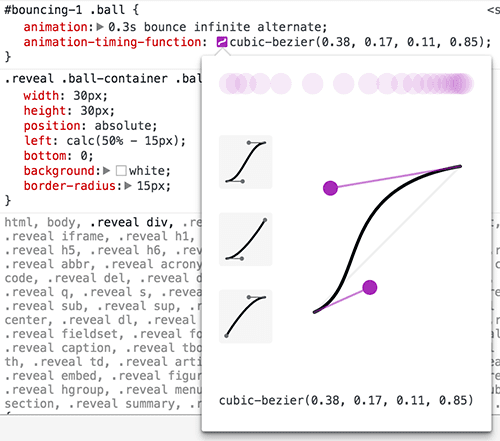
This bouncing dot animation uses yet another fairly simple @keyframes at-rule, it’s just using the transform property to translate the dot up, and I’m using ‘alternate’ for the animation-direction again. To make it look more “bouncy” I’ve defined a ‘cubic-bezier’ function for the animation-timing-function property. If that looks a little daunting to you, don’t worry, I didn’t actually write this, and you should never need to write one of these by hand because Chrome (and possibly other browsers?) has an awesome bezier curve editor where you can just drag some dots to visually create the cubic-bezier curve and it will write the cubic-bezier function for you.

Finally, to create this excitedly impatient series of dots, I’ve defined a slightly more complex @keyframes at-rule which performs the translation up and down in just the first 1/3rd of the time. I’ve also set an animation-delay for each of the dots in the series to offset them starting.
Wrapping Up
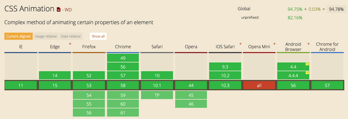
Most of this is relatively new to the CSS spec but support in modern browsers is actually really good. Depending what browsers you need to target though you’ll get a lot of mileage out of using autoprefixer to process your CSS and automatically add any required vendor prefixes like -webkit, -moz, etc.
MDN is a great learning resources for understanding CSS properties and rules. There’s also a really helpful guide on using CSS animations:

